Redesigning Taco Bell's Rewards and Loyalty System
Challenge
Taco Bell was continuing to expand its presence in the UK and preparing to launch Live Más Club, a new tier within its loyalty program. As part of this effort, Taco Bell set out to redesign its rewards experience and create a stronger foundation for future loyalty offerings.
Solution
Working closely with Taco Bell and DEPT over a two-month engagement, we redesigned the rewards experience across the app and introduced Live Más Club as a new loyalty tier. The redesign established a clearer structure for rewards content and surfaced loyalty benefits throughout the customer journey.
Impact
The redesigned rewards experience and Live Más Club launched as part of a UK app update. Taco Bell Europe reported over 15% system sales growth in fiscal 2025, with the UK identified as a key contributor.
My Role
As UX Lead, I worked closely with a team of six designers and stakeholders across Taco Bell and DEPT. From discovery through final design, I led the UX direction for the rewards experience, defining the content structure, taxonomy, information architecture, and key user flows. I also established how Live Más Club would integrate into the existing loyalty ecosystem, including its navigation, entry points, and overall experience framework.
Audit
Auditing the existing experience
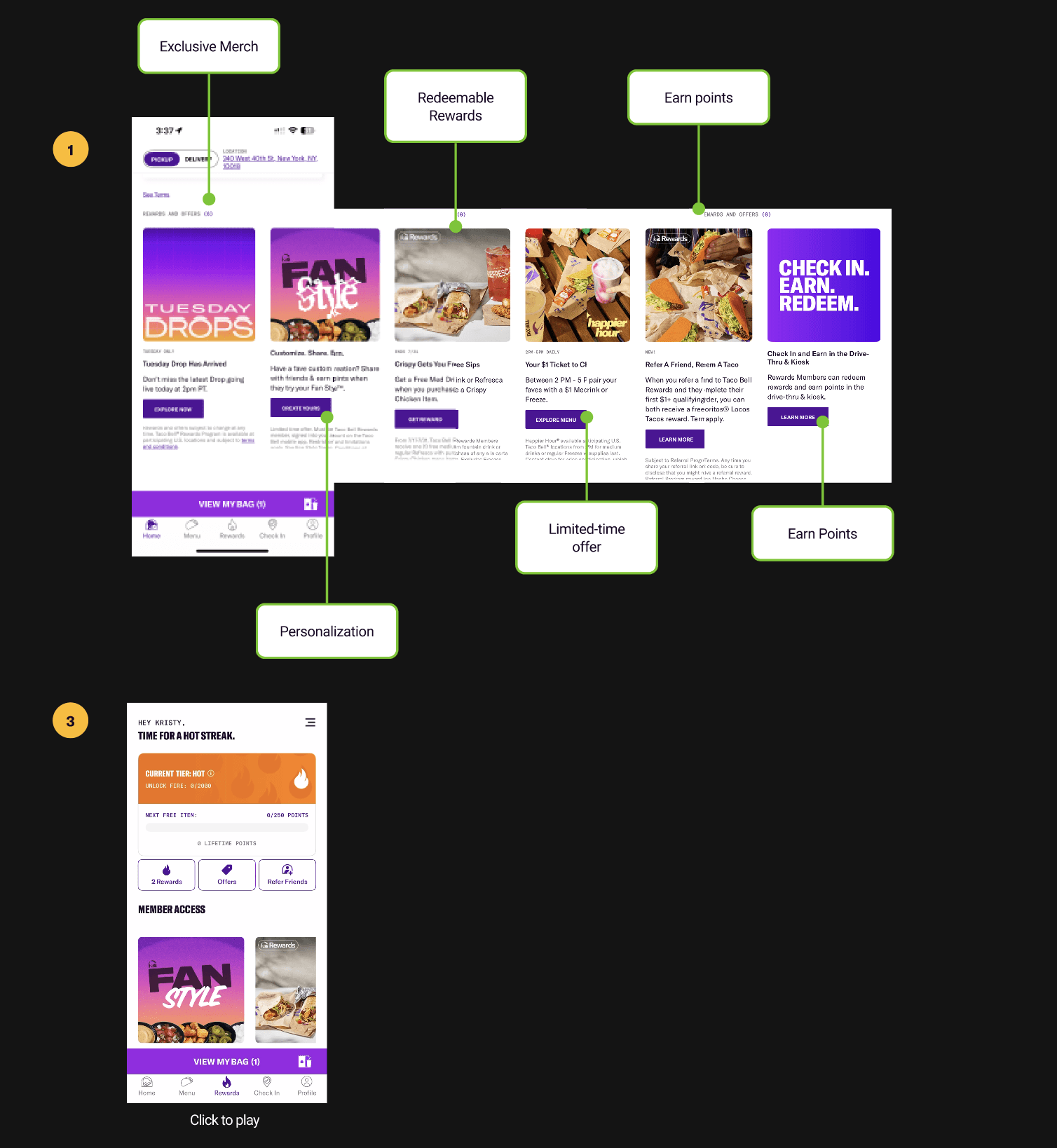
I conducted an audit of the existing rewards experience to identify opportunities and pain points across the customer journey. The audit uncovered four issues that affected how members discovered rewards, understood the program, and engaged with the loyalty experience.


Define
Pain point #1
Inconsistent architecture and content organization
Establish a clear content model
I defined a content model to separate three content types that were often used interchangeably in the existing experience: redeemable rewards, ways to earn points, and limited-time offers. This established clearer patterns for how each content type should behave and created a more scalable foundation for future rewards content.

Redeemable rewards
Definition
Items users can redeem using points they’ve earned
CTA
Add to order
Design Pattern
Carousel

Ways to Earn Points
Definition
Actions users can take to gain XP
Design Pattern
Card
CTA
Start now
Limited-time offers
Definition
Limited time promotions for all users, no points required
CTA
Add to order
Design Pattern
Full-screen card
Design
Re-designing the experience
With the content model established, I led the UX direction for how rewards would be integrated throughout the app. The next three design decisions addressed the remaining pain points: increasing reward visibility, clarifying how the system works, and reducing friction in earning and redemption.
Through wireframes and design reviews, I worked closely with the UI team to translate these ideas into a cohesive end-to-end experience.

Pain point #2
Bring rewards into the journey
To increase awareness of the rewards program, I introduced reward modules at key moments throughout the ordering journey, making rewards easier to discover without requiring users to leave the experience.
Persistent loyalty status
Made XP balance and tier status visible throughout the experience through a persistent rewards banner on the homepage.
Rewards at checkout
Surfaced redemption opportunities directly within the bag at the point of purchase.
Rewards within browsing
Surfaced XP progress and limited-time offers directly within the menu
Pain point #3
Make redeeming easier
I redesigned redemption as part of the ordering experience, allowing users to redeem rewards directly from the menu or Rewards page and continue ordering without leaving the flow.
Rewards page
Enabled users to redeem rewards directly from the reward detail page.
Bag
Redeemed item confirmed with XP used and discount applied, so users know what they are getting before checkout.
Pain point #4
Clarify how the system works
To make the rewards system easier to understand, I reorganized the experience around three content types: Redeem, Earn, and Benefits. This created a clearer structure for rewards, earning opportunities, and tier information while reducing the need to navigate between multiple screens.
Redeem
Organized rewards by XP value, making available rewards easier to browse while creating a scalable structure for future reward offerings.
Earn
Created a dedicated space for earning opportunities, helping members understand how to accumulate XP and progress through the loyalty program.
Benefits
Consolidated tier status, lifetime XP, and member perks into a single view, making program benefits and progression easier to understand.
Designing for Live Más Club
In addition to renewing the rewards experience, I led the UX work for Live Más Club, a new loyalty tier within Taco Bell's rewards program.
The Taco Bell team envisioned Live Más Club as an exclusive experience with its own identity and interaction model. During this phase of the engagement, I focused on how Live Más Club would integrate with the existing app, including navigation, information architecture, and reward structure.
I created wireframes to explore how users would discover and access the experience while preserving its distinct identity. One of the key challenges was balancing exclusivity with discoverability, ensuring users could find and enter Live Más Club without making it feel disconnected from the broader rewards experience.
The final approach introduced dedicated entry points on Home and Rewards while using distinct visual treatments to differentiate Live Más Club from the standard rewards experience.
Learnings
Learnings
This project reinforced the importance of structure and information architecture in shaping successful experiences. Many of the issues uncovered during the audit stemmed from how information was organized, without clear definitions, patterns, or hierarchy. Establishing a content model, navigation structure, and information architecture created a stronger foundation for the rewards experience and made it easier to support future additions without introducing additional complexity.
It also reinforced the value of design leadership beyond individual screens. Creating alignment through wireframes, design rationale, and shared frameworks proved just as valuable as the final designs themselves, giving the team a clearer foundation to build from and align around.

Overview
Jump to
Overview
Jump to ↓
Overview
Jump to